


[fig 1]
Graphic Design + BrandingAmTrust Agile
SUMMARY:
As a lead senior designer, my challenge was to create a unique logo mark for an internal AmTrust group for agile project management leaders. I designed a custom typeface where the “g” and “i” subtly merge, a typographic solution symbolizing cohesion and continuous improvement.
CLIENT:
Agile project management at AmTrust thrives on iteration, interaction, and innovation. It values people over process, feedback over formality, and results over rigid plans. At its core, it empowers teams with autonomy, adaptability, and the confidence to shift course at a moment’s notice.
ROLE:
Designer, 2021-22
[fig 2]

[fig 3]

[fig 4]

[fig 5]

[fig 6]

[fig 7]

[fig 8]

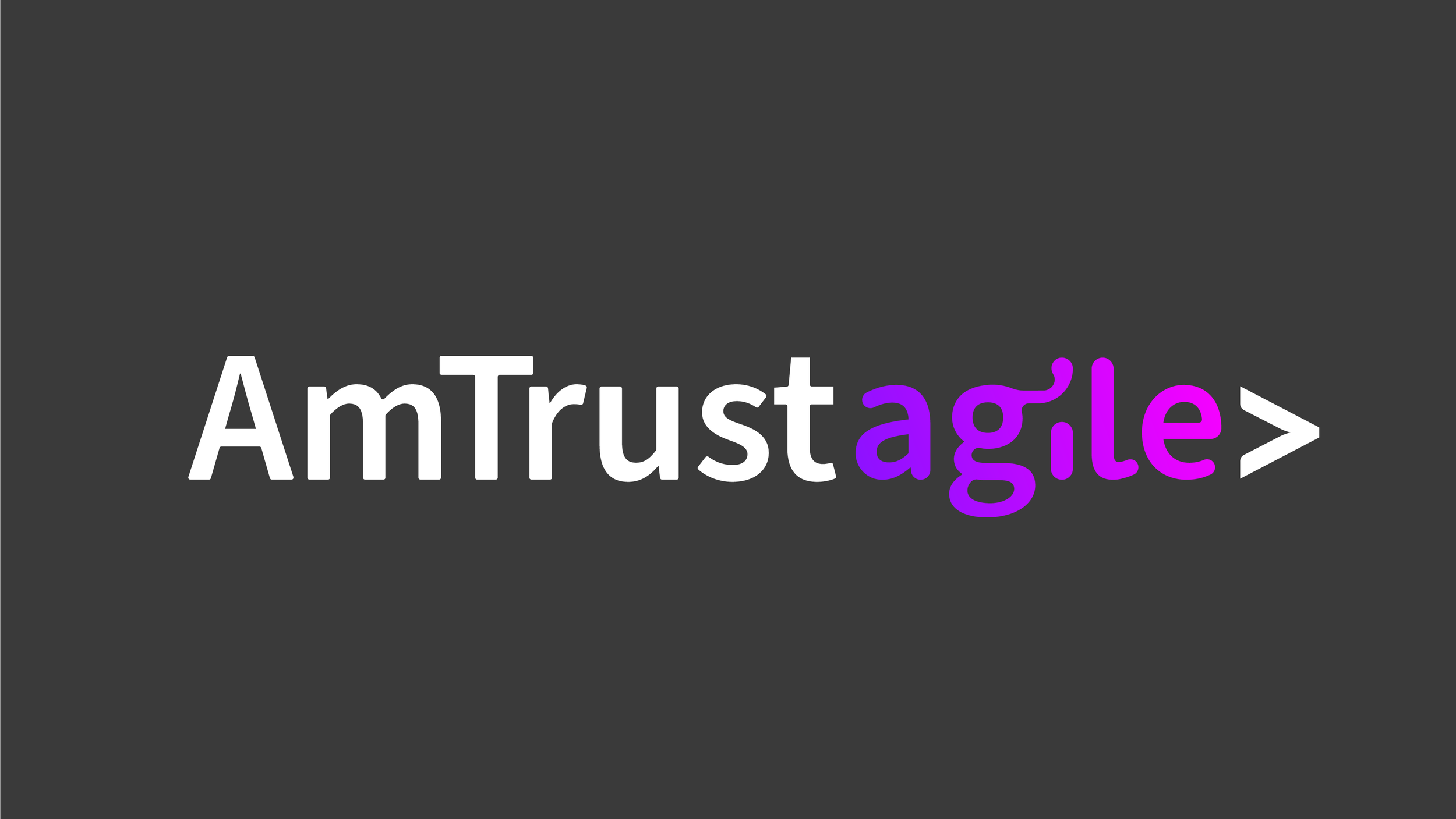
Alternate Logo
Scrum-based Agile Logo
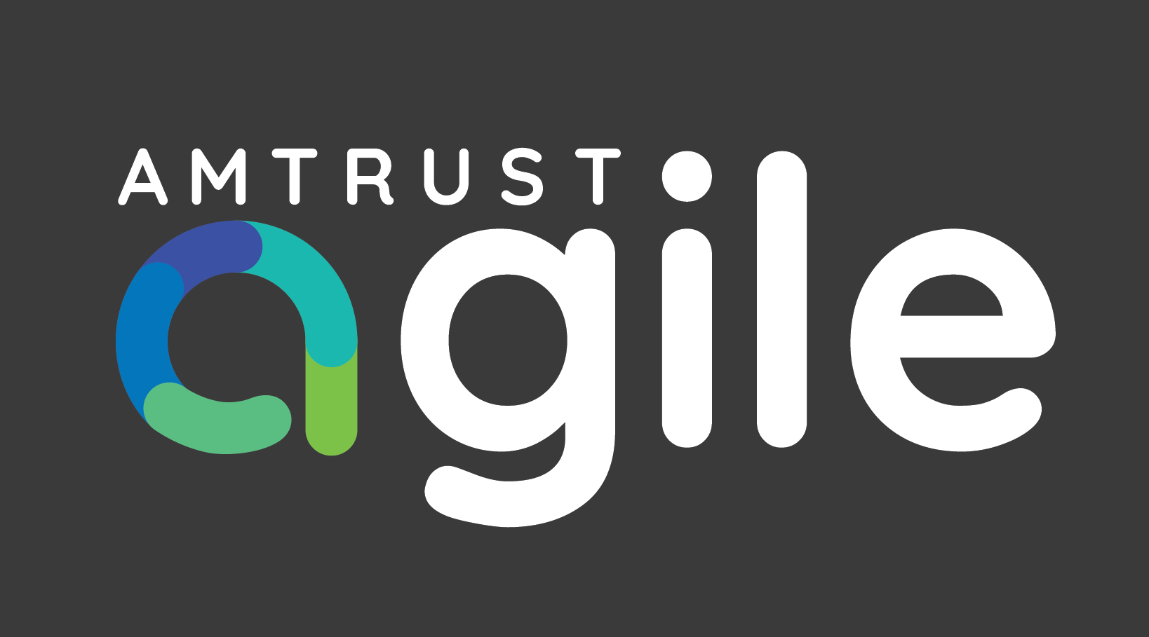
Actual logo and logo mark chosen for AmTrust Agile.
The logo is built around a clean, continuous circular form, symbolizing the iterative nature of Scrum and the concept of continuous improvement.
The “a” circle is not a perfect ring but subtly segmented, echoing the stages of a Scrum sprint.
A combination of blues (trust) and greens (growth), were used to reflect balance between reliability, evolution, and momentum.
[fig 9]

[fig 10]

[fig 11]

[fig 12]
[fig 13]

[fig 14]