


UX CASE STUDY
Research and Design for Digital Onboarding
SUMMARY:
As a user experience strategist for Digital Onboarding within the Account Selection and Enrollment Team, I partnered with product teams and leadership to analyze, research and re-design a current-state onboarding tool. This proposal tool would later evolve into an onboarding hub to help FAs/BOAs propose new accounts for clients.
To respect confidentiality agreements, visual elements have been altered and modified.
CLIENT:
Edward Jones is a financial services firm that offers a personal approach to investing.
ROLE:
UX Researcher/Designer, 2021-22
Designed Solution

[fig 1]

[fig 2]

[fig 3]
Above: Responsive wireframes for EDJ that mimic the relationship enrollment dashboard and profile snapshot.
What are we trying to solve?
The Challenge
As part of the digital branch experience, my team’s goal was to design the future state onboarding flow of internal branch and consumer-facing application(s) and that focused on optimizing account opening and account proposal processes.


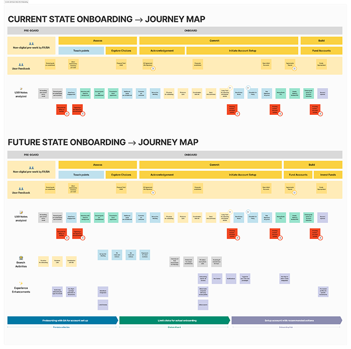
The Process and Journey 🔎
Understanding the user is paramount in solving the problem. My team managed discovery and design work for onboarding proposals which included current state user-journey analysis, collecting and analyzing user behaviors and user pain points, and mapping future-state user flows.
Capturing insights through research, my product team then synthesized findings into a visual onboarding experience as a dashboard for financial advisors, branch administrators and potential client use.
First things first: My team took a look at current state tools to understand how Financial Advisors and Branch Administrators complete their tasks today. We began our journey with discovery and research and worked with direct users for insights.
Over the term of this onboarding proposal tool project, I worked with digital branch experience and product teams to establish and document best practices for working with vendors and product managers. I also worked closely with product owners and business system analysts to establish and write requirements. Collaboration with Design Systems Teams, Accessibility Specialists and Product Development was paramount in ensuring a successful MVP launch of our new onboarding tool.
As a senior tech stack designer, I also mentored fellow designers that joined the digital onboarding product team to continue high-quality design deliverables for stakeholders.
Start at the beginning…
Empathize with Research
Discovery work for the onboarding proposal tool began with research including:
Conducting market research between other fintech/investment firms
Competitive Analysis
User Interviews between FAs and BAs of various experience levels
Empathy mapping via Mural to define insights and needs to formulate proto-personas
Journey mapping for product to expose pain points and identify shifts in user types
Defining the current state problems to inform project goals

[fig 4]
I gathered information and clustered via Mural to identify common patterns such as ways of working, situational circumstances and frustrations that users have when using the current tool. We analyzed types of users and their specific pain points to define insights and further identify design recommendations.
Insights gathered here allowed for my team to deliver benchmark data for digital onboarding to stakeholders.

[fig 4]
[fig 5]


[fig 6]
Define and Ideate
After organizing user types, my team was able to pull insights and needs gained from research to identify common challenges and pair them with business goals. My team created:
POV statements to better understand user’s problems,
“How Might We” Questions for potential future state solutions
Using product approved HMW questions, the user experience team brainstormed high-level task flows and journey maps
I also worked with product to refine those requirements for our future-state tool to inform the business of key learnings and opportunities
With these in mind, I wondered...
How might we design a seamless onboarding experience that meets the needs of both internal branch staff and consumers?
How might we simplify the proposal and account opening process?
[fig 8]

Above is a sample graphic of a HMW cluster brainstorming session.
Create user flows and identify tasks
My team and I mapped out current-state journeys and began to identify areas for improvement.
Using this research, product and design co-created future-state flows for onboarding with these improvements. The proposal tool is just one of many parts in a deeply layered onboarding process, so we were mindful to keep steps at a minimum.
Using key tasks as requirements, our user experience team wanted to explore how user types would be interacting with these new features to complete business-identified tasks.
[fig 9]
What we did
The Solution(s)
My team built several artifacts to assist in the onboarding process, including a service blueprint artifact. This helped us identify personas and business model challenges. These insights would further promote informed design decisions.
While following a dual-track agile process, research and design created living personas which included the FA (Financial Advisor), the BA (Branch Administrator), and the Client(s). I also assisted in facilitating user sessions for FAs/BAs.
MVP was successfully designed for proposal tool and onboarding hub concepts using these personas. Using these UI prototypes, my team ran user testing sessions including A/B testing for a proposal dashboard, user snapshot, profile management and onboarding workflow(s).
Also collaborated with vendors like SalesForce and MoneyGuide for separate applications.
Low-Fidelity Wireframes

[fig 10 A, B]
Sketches to Wireframes
Before jumping into high-fi designs, I sketched out several scalable dashboard concepts to review internally. As a team we iterated on two (2) designs that featured the same components but in different hierarchies. These sketches were then built into high-fidelity designs for prototyping for more user testing.
[fig 11]

[fig 12]

[fig 13]
[fig 14]

Account dashboard for users to view their accounts, search details, and identify relationship accounts quickly at a glance. Future enhancements suggestions included a client vs FA/BA toggle, e-sign integration, interactive stat projections and doc center for important documents.
[fig 15]

Usability Testing
Using the high-fi prototype with limited interactions and functionality, my team tested these designs with FA users to measure its usability and identify any areas of improvement as well as ask for open suggestions.
We also used Qualtrics with similar prototypes to A/B test dashboard designs on other FA users.
[fig 16]
[fig 17]
[fig 18]
Future relationship enrollment proposal dashboard highlights a “snapshot” of the most frequented items from a financial advisor’s perspective. Filterable charts, like the one above in figure 16, were found to be of benefit to users accessing their accounts.
The Outcome
Provided service blue-print, persona work and gathered usability testing insights for product ownership for informed decision-making on relationship onboarding.
I also provided wireframes, mid-fi clickable prototypes for product.
*Graphic imaging has been altered, recreated, re-sourced and borrowed to protect PII and to follow confidentiality clauses.